Muppet Robin Hood #1
6.0
Critic Rating
1 Reviews
N/A
User Rating
| Writer | Tim Beedle |
| Artist | Armand Villavert |
CRITIC REVIEWS Back to Top
-
6.0
Eye On Comics - Don MacPherson
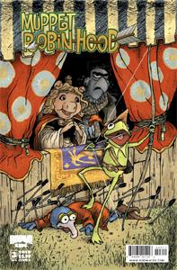
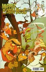
May 31, 2009The artwork is quite different from what we've seen from Langridge, but Villavert takes a similar approach. Instead of trying to reproduce photorealistic representations of the Muppets, he takes a more organic approach. The artist employs an elongated style that's a bit distracting at times. Kermit often looks too tall, and Sweetums doesn't seem to be nearly as imposing a figure as he has in the past. My favorite visual comes from the one of the two regular covers. That Kermit/Sweetums cover is by Mouse Guard creator David Peterson, and it demonstrates what a talented artist he truly is. Read Full Review
USER REVIEWS Back to Top
No user ratings have been found for this issue.


