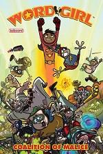
Wordgirl: Coalition Of Malice #1
 ►
►
Critic Rating
User Rating
| Writer | Chris Karwowski |
| Artist | Steve Young |
CRITIC REVIEWS Back to Top
-
6.0
Eye On Comics - Don MacPherson
Oct 14, 2011Honestly, the most fun aspects of the book are the villain concepts. Some of them are rather odd and demented, quite irreverent. Chuck the Sandwich Making Guy and Lady Redundant Woman were my particular favorites. The art in the first story, focusing on a teamup among the title character's worst enemies (thus the subtitle of the book), is definitely the stronger of the two visuals styles to be found here. Steve Young's exaggerated linework brings a lot of energy to the story, which is vital since the plot is low on action. Young keeps the eye engaged with sharp designs and a constantly moving "camera." Pat Lapierre's art for the second story, featuring the title character's ordeal with a multiplying villainess and a gaggle of interfering fans, is much rougher around the edges. Lapierre still brings energy to the characters, but the quality of the art isn't as polished. It looks a bit more amateurish in tone, and it pales in comparison to Young's effort. Read Full Review
USER REVIEWS Back to Top
No user ratings have been found for this issue.

