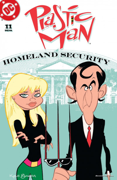
Plastic Man #11
Critic Rating
User Rating
| Writer | Kyle Baker |
| Artist | Kyle Baker |
If Plastic Man is in charge of Homeland Security, how secure can it be?
CRITIC REVIEWS Back to Top
-
10
Comics Bulletin - Jason Cornwell
Oct 29, 2004Kyle Baker's art is a decidedly cartoonish style, and I imagine that new readers will find it as visually jarring as I did when I picked up the first issue, but I have to state that I can't think of another title on the stands that features a style of art that is as ideally matched to the style of writing as this series. Now of course this is probably due to the fact that Kyle Baker is pretty much the entire creative team, which makes providing a unified final vision quite simple to accomplish, but this doesn't make it any less enjoyable. I mean the visual gags can't be presented any better, from Superman's battle with Luthor's secretary, to the final pages as the art manages to reflect the various personalities of the characters in their new bodies. The art does a wonderful job of keeping the overall tone as goofy as the book can be, but it also manages to keep a solid grasp on the idea that it's still responsible for presenting a clear final vision. Read Full Review
USER REVIEWS Back to Top
-
8.0+ Like • Comment


