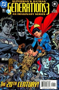
The weakest area of the book is actually in the artwork, but I don't believe you can lay the blame squarely on Mr. Byrne's shoulders. His artwork simply looks better when on the traditional comic book paper. This glossy, shiny paper makes the inking look too dark and draws away some of the depth. Still, you cannot mistake John Byrne's style, and he keeps everything moving. He even manages to vary the female characters' appearance: a common complaint of his artwork. Read Full Review
Be the first to rate this issue!
Click the 'Rate/Write A Review' link above to get started.