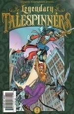
Grant Bond's artwork is clearly influenced by American animation, and his exaggerated style suits the broad-strokes approach of the plotting and the imagination inherent in the premise. The color scheme is exceedingly dark, but it makes sense in the context of the story. We're still in the "real world" so far in the story, and there's a hint that brighter tones will emerge once the characters and the audience cross over to the other side of the looking glass. Read Full Review
Be the first to rate this issue!
Click the 'Rate/Write A Review' link above to get started.