CRITIC REVIEWS Back to Top
-
8.0
Comics Bulletin - Nick Hanover
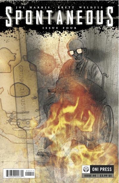
Oct 22, 2011Weldele's art is stellar as always, and here he gets far more room to play with abstraction than ever before, particularly in regards to Melvin reaching his potential. There are some issues with weak lettering, as the overly digitized typing clashes wildly with Weldele's loose, scratchy penciling, with the worst of it happening right at the start: Read Full Review
USER REVIEWS Back to Top
No user ratings have been found for this issue.


