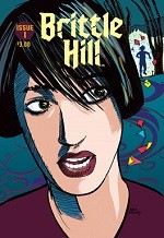
Brittle Hill #1
 ►
►
Critic Rating
User Rating
| Writer | Alan Spinney |
| Artist | Helen Spinney |
CRITIC REVIEWS Back to Top
-
3.0
Eye On Comics - Don MacPherson
Jul 28, 2014Alan Spinney's art, upon a superficial glance, seems to have some sense of anatomy, but it doesn't quite get the figures just right. Look at the cover image. The protagonist, pursued or peeped by an impossible creature, seems to lack ears, and her hair, while tousled in the front, seems rigid on the sides. Spinney's backgrounds are crude, and his slightly better figures don't seem to belong in that flat world behind them. The colors are intriguing, in that bright, primary colors are reserved for the odd candy people who play a role, while muted tones are used for the stereotypically morose goth kids. I appreciate the passion, determination and resources that have to go into a personal project such as this one, but the Spinneys definitely have to hone their craft before they're ready for a wider audience. Read Full Review
USER REVIEWS Back to Top
No user ratings have been found for this issue.

