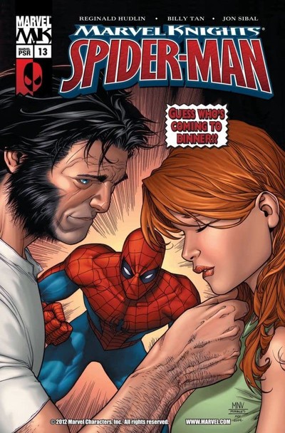
Marvel Knights Spider-Man #13
| Writer | Reginald Hudlin |
| Artist | Billy Tan |
Peter Parker's got an incredible new pad, a new job, and a new nemesis who's everything that Peter isn't. But first, Spider-Man's got to deal with a shape-shifting super-villain who's developed a nasty habit. And wait -- who's that hitting on Mary Jane!?
CRITIC REVIEWS Back to Top
-
6.0
Comics Bulletin - Jason Cornwell
Apr 21, 2005Billy Tan looks to be a fairly new artist as his work has some decided rough edges. For example, his characters look more like they are posing for a photo instead of natural body movement, and his backgrounds lack the three-dimensional quality that more accomplished artists seem to have no problem with. However, since both of these elements look to be qualities that plague most artists early in the careers I think it's pretty safe to say they are also elements that are smoothed over with experience, and as such I'm not going to make too much noise about them. However, a more troublesome area is that the art struggles to the clearly delivery the action, as Spider-Man's battle with the Absorbing Man is a rather flat experience visually, thanks to some extremely poor manner in which the action on the page was laid out. He also makes Mary Jane look like a teenage girl, and Peter spends most of the issue missing his neck, both of which were distracting visual elements during key section Read Full Review
USER REVIEWS Back to Top
-
8.5
You know, I like it. First time I read this comic was the end of 2006. And yeah, it feels much less darker, than previous Mark Millar arcs, but it's still good and interesting to read. There were some events in the Amazing Spider-Man series, so now Peter lives with Avengers and it was very fresh in those years, character gave kinda new feeling for me. The artist is nice too. Yeah, he wasn't that experienced in those years, but I still like his drawings and especially emotions of the characters. Also this comic had a very weird page splitted in two pages, but it had a portrait orientation instead of landscape. Feels kinda unique, never saw something like that anywhere else.
Yeah, this comic had some... disgusting moments, like Absor more+ Like • Comment -
4.0
Weak all around.
-
7.0


