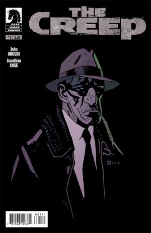
The Creep #1
Critic Rating
User Rating
| Writer | John Arcudi |
| Artist | Jonathan Case |
| Cover Price | $3.50 |
A pair of teen suicides raise terrible questions, but can a grim private eye commit himself to a case that is so closely connected to his own haunted past?
CRITIC REVIEWS Back to Top
-
10
Comic Bastards - Matt Wilkins
Sep 10, 2012No, there is no action in this book. What is here will linger with you longer than any bruise or broken bone. It's deep in your gut with your fears and resignation. Read Full Review
-
10
Comic Vine - Sara 'Babs' Lima
Sep 12, 2012I really liked the art in this issue. It's organized, just like the script, and it is really well done. It focuses in on the expressions of different characters at the right moments. For example, the scene where Oxel's friend hands him a bottle of pills and the focus moves to both the men's faces is fantastic. It really captures the torment that Oxel experiences. Does he take the pills or doesn't he? Another moment where he is being hounded by a group of young men, we see Oxel's blank stare. This one image can be interpreted in so many different ways. I think the art is great, but the layout is really what makes it powerful. The choice in colors are these somber shades of grey that are really appropriate in telling this sad story. Great layout construction, really nice dialogue and a perfect set up for this series. I was left with a lot of questions and I am definitely looking forward to the next issue. Read Full Review
-
8.8
Geek Smash - Sam Johnson
Sep 19, 2012The #0 issue " well written by John Arcudi, with a well-defined, melancholy feel to its world, and good dialogue " gripped me, and #1 strengthens that hold by taking things a little deeper. 'Slow' fits the feel of The Creep's world, but things need to advance in #2, after two issues that have been so similar. Read Full Review
-
8.5
IGN - Joey Esposito
Sep 12, 2012Which leads to the only real problem for this issue " the numbering. It's not that big of a deal, I suppose, but despite being an issue #1, this book necessitates that you read #0. There's no benefit of exposition, and the story assumes you know what's going on. So if you snagged this and were unaware that there's a whole chapter before this one, seek out #0 before diving in, otherwise you'll really only be getting the broad strokes of what's going on. Read Full Review
-
8.4
Forces Of Geek - Atlee Greene
Sep 17, 2012The plot will put the reader through a loop and the artwork is solid all around. If you are looking for something different with a lot of twists and turns, you found it right here. Read Full Review
-
7.0
Read Comic Books - ReadComicBooks
Sep 12, 2012The art of Jonathan Case is good, I enjoyed it. Its almost noir style plays well with the character that Arcudi has brought to the table. There was a sort of stoned-dream sequence where the art takes a bit of a shift that I really enjoyed, actually. I want to see more from him, and see what he has in store for the rest of The Creep. Bottom line here, I did like the story. Its being built up, and Arcudi is crafting a world for us to enjoy and want to come back to. This is only the beginning of this series, but I will definitely be back for more. Read Full Review
-
6.0
The Fandom Post - John Rose
Sep 12, 2012The first issue of The Creep looks like it is accomplishing more in terms of setting the environment both in terms of visuals and the characters that will play a role in things than attempting to grab hold of the viewer and drag them in though there are a couple incidents that are just off enough that they may catch the reader's attention and imagination. With possibly the most minimalist set up being presented right now it looks like the story is going to be counting on its author's name and the basic story premise that was used to solicit the title more than anything in the issue itself to convince readers to keep this title on their pull list as what is shown here may not be enough for those who cut titles early that may not live up to expectations. Read Full Review
-
6.0
Newsarama - Vanessa Gabriel
Sep 13, 2012The Creep #1 presents a picture of desolation and sadness in the aftermath of suicide, but there remains a small sliver of hope " that is, if Oxel can put the pieces together. Read Full Review
-
6.0
Bloody Disgusting - GreenBasterd and Lonmonster
Sep 13, 2012Oxel comes decision that these "suicides" are worth looking into, which leads me to believe the story will pick up. New readers should be wary due to the lack of action, but fans of dark, and I mean really dark, detective fiction will undoubtedly enjoy the lethargy. Read Full Review
USER REVIEWS Back to Top
No user ratings have been found for this issue.


