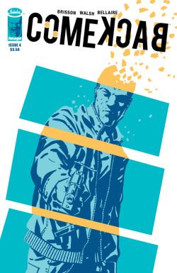
Comeback #4
| Writer | Ed Brisson |
| Artist | Michael Walsh |
| Cover Price | $3.50 |
Things go further upside down for RECONNECT Agent Mark Thompson. His partner is dead and his mission failed. Now both the FBI and his former employer, a man more frightening than any government agency, are hot on his tail. One wants him in jail, the other wants him dead.
CRITIC REVIEWS Back to Top
-
10
Comic Vine - Tony 'G-Man' Guerrero
Feb 27, 2013This isn't the best issue to start with obviously. I would highly recommend tracking down this entire series if you've been missing out. It's a refreshing story with a different take on time travel. Read Full Review
-
9.0
The Weekly Crisis - Grant McLaughlin
Mar 01, 2013Comeback continues to be phenomenal. All the individual pieces are brilliant, and they perfectly support each other, resulting in a whole that is greater than its parts. This series has been compelling as all get out since issue #1, but the twist the creative team drops in this issue takes the story to another level entirely. Comeback #5 cannot come soon enough. Read Full Review
-
8.5
IGN - Melissa Grey
Feb 27, 2013Michael Walsh's rough-edged art suits the increasingly frenetic pace of the narrative and it lends it a gritty flavor that doesn't feel overdone. Jordie Bellaire continues to be the queen of coloring and her palette is minimal and muted when it needs to be and vibrant and rich as the situation calls for it. The visuals are particularly well played at the issue's end, when a series of game-changing time hijinks sets up the final chapter in such a way that it's virtually impossible to predict where Brisson is going to go next. And that's very much a good thing. Read Full Review
-
8.0
Comic Bastards - Steve Paugh
Feb 27, 2013I'm very much on-board for Comeback's finale next issue and can't wait to see how this whole thing is going to end. It will be a pleasure to reconnect with it one more time. Read Full Review
-
7.0
Comic Book Resources - Augie De Blieck Jr.
Feb 27, 2013"Comeback" is another all-too-silent winner from Image. If next month's ending can reset the story in an interesting way, the mini will have succeeding in telling a focused time travel story with a corporate twist that entertains without confusing. I'll take more of those. Read Full Review
-
7.0
Comics Bulletin - Danny Djeljosevic
Mar 06, 2013On the art side, Michael Walsh and Jordie Bellaire provide really great interior pages with some fantastic sequences and striking images where everything turns one color or the background drops out for emphasis. I love stuff like that, especially when Walsh drops the background and fills it with thick, emotional brush strokes. It's one of those things you can do in comics without being deemed too flashy or gimmicky -- sometimes creating an abstract visual representation of the emotion or power of the moment is better than just meticulously drawing characters in tangible locations with natural coloring. Read Full Review
USER REVIEWS Back to Top
No user ratings have been found for this issue.


