Dead Letters #3
| Writer | Christopher Sebela |
| Artist | Chris Visions |
| Cover Price | $3.99 |
You can't die twice... unless you're "Here." Sam's about to find that out the hard way, as his double-cross is discovered by Mr. Jones and his right-hand man Charnel, a serial killer in a past life who has found renewed vigor and purpose in the dark city.
CRITIC REVIEWS Back to Top
-
10
Comic Bastards - Nick Philpott
Jun 11, 2014There's room enough in this town for Ma and Jones and Charnel and Sam and Beryl and the whole sick crew. But what's rapidly becoming apparent is that none of them want to stay there, and the next place they end up may not be so forgiving (or in this case, so blas). Read Full Review
-
8.0
Horror DNA - James Ferguson
Jun 17, 2014Dead Letters has pulled me in. I'm dying (HAR HAR!) to find out what happened to Beryl, how Sam is going to figure it out, and more importantly, what he's going to do next. There's a larger mystery at work here. I've never been more interested in dead people. Read Full Review
-
6.0
All-Comic - Dan Pennacchia
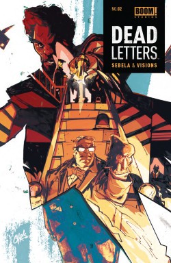
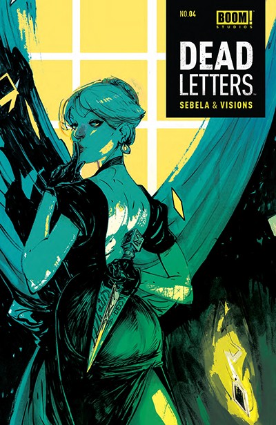
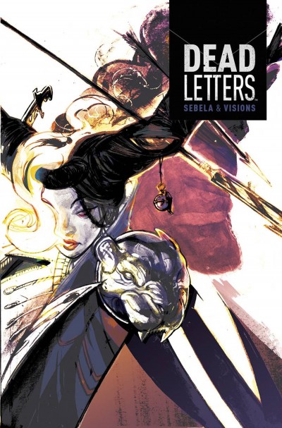
Jun 12, 2014At one point, in one of many exchanges, a character makes mention of Sam not belonging. There is some indication given to his character being different in some way, and that it is possible that his inability to remember dying is connected. Sebela may have a bit too much written on the page in issue 3, but he still continues to plant very intriguing seeds. Chris Vision's puts out the best cover of the series so far. The imagery on display is gorgeous and it's coloring is just as impressive. Ruth Redmond works with Vision's style quite well and the two combine for some really fantastic pages. Their loose style, though, does work against the story in a few moments when the panel work makes a sequence a bit of a challenge. Overall, though, the art is quite gorgeous. As the story moves forward, the final pages promise for some interesting moments to come in the Dead Letters universe. Read Full Review
-
5.0
ComicBuzz - ZXRoberts
Aug 29, 2014An overcomplicated plot that relies far too much on text is made more tedious by art work that simply has no fluidity. The illustrations and panel structure change from page to page as rapidly as Sam changes his personality, all in all it is a contrived mess. Having brought the first four issues, I have removed #5 from my pull list, like most comic fans I can only afford the books I cant live without. This could have been a dynamically interesting take on an old tale (the man with no memory) but simply attempts to tell a far too complex story with poor focus on the themes attempted- memory loss and self-reflection; as well as too little or contrived character development. Read Full Review
-
4.0
Big Comic Page - Shane Hoffman
Jun 10, 2014Chris Visions artwork, while it is definitely his own unique style, does little to help alleviate the confusion in the story telling. Sometimes when a story is hard to follow the artwork can fill in the gaps in the actual word play. However, in this case, I found the artwork just as hard to follow as the story. There is a lot crammed into every panel on every page, which is a commendable approach but which also leaves the eye confused as to who is who, what panel is next, and who or what is actually in each panel. So while the story. So while I appreciate the unique style and the work put into every issue, for me its just too much going on and not clearly defined enough to really hook me. Read Full Review
USER REVIEWS Back to Top
No user ratings have been found for this issue.


