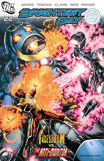
Brightest Day #22
| Writer | Geoff Johns |
| Artist | Scott Clark |
| Cover Price | $2.99 |
As the end of BRIGHTEST DAY approaches, our returned heroes and villains begin converging in one area as the ultimate protector reveals itself against the ultimate menace!
CRITIC REVIEWS Back to Top
-
8.0
Comic Book Resources - Doug Zawisza
Mar 16, 2011Clark's art, while heavily photo-referenced for backgrounds and atmosphere, is filled with stark shadows, adding to the great emotions and character acting Clark puts upon these characters. The final two pages take Firestorm away from the Antimatter Universe, and the contrast in art styles between Clark and Ivan Reis is dramatic and well-suited for the story and the shifting location. There is only a pair of issues left, and I'm still not completely certain what the end game is that is being played towards here, but I am definitely along for the ride. Read Full Review
-
8.0
Weekly Comic Book Review - DS Arsenault
Mar 16, 2011I liked the plot and the art told the story, with some very effective visual moments, but I couldn't really engage with the weak main character. I recommend that Brightest Day fans and Firestorm fans tune in and buy. Read Full Review
-
8.0
cxPulp - Blake Petit
Mar 18, 2011Gary Frank and Nathan Eyring nail a really great cover, topping off this package. Going into the final two issues, Brightest Day is really satisfying. Read Full Review
-
6.0
I'm starting to notice a trend with the last few issues of Brightest Day. Each has spotlighted a specific character and wrapped up their storyline in order to put them on the path towards Brightest Day's end-game. While Aquaman and Martain Manhunter have been done justice, Firestorm's finale falls a little short. Hopefully Geoff Johns, Peter Tomasi and the rest of the BD crew can bounce back in two weeks for the penultimate issue. Read Full Review
-
5.0
Eye On Comics - Don MacPherson
Mar 17, 2011Another reason that the Firestorm sequences in this series have been so off-putting is due to the art. It's not that Scott Clark's dark, angular style - which seems to be clearly influenced by that of Jae Lee - doesn't have its strengths. It just doesn't fit the character and this series all that well. For the most part, this is a traditional super-hero comic, and Clark's style isn't traditional. Furthermore, it's inconsistent with the work of the other series' artists (as is clearly apparent when Ivan Reis and Joe Prado take over the linework duties in the last few pages of this issue). Clark also takes some unfortunate shortcuts when it comes to several characters. He handles the Anti-Monitor's meticulous detailed design well enough, but it's incredibly hard to make out any of the Black Lanterns other than the (horribly named) Deathstorm. Read Full Review
-
4.0
X-Man's Comic Blog - x-man75
Apr 09, 2011You know what the worst thing about this comic book was? It WASN'T that bad! I mean come on, I read this comic because I KNOW it's gonna suck, so the fact that it was pretty good kind of bummed me out. Read Full Review
USER REVIEWS Back to Top
-
7.5
Deathstorm and the Anti-Monitor's involvement was pretty pointless but Johns and Tomasi develop Ronnie perfectly throughout this issue. They nailed the execution on Professor Stein's death. So sad
+ Like • Comment -
8.5
-
8.5
-
7.5
-
7.0
-
7.0
-
5.0


