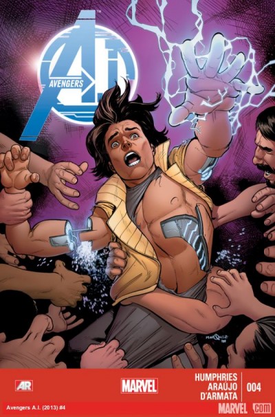
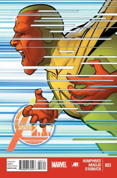
Avengers A.I. #3
| Writer | Samuel Ryan Humphries |
| Artist | David Marquez |
| Cover Price | $2.99 |
Experience THE DIAMOND, a surreal new world of artificial intelligence! The Vision is trapped within this virtual realm...but is he prisoner, or savior? And YOU -- how many times have YOU looked at your phone today? What are YOU to the devices in your life -- prisoner, or savior? Prepare yourself for the kingdom of thinking machines!
CRITIC REVIEWS Back to Top
-
8.5
Behind The Panels - Richard Gray
Sep 05, 2013Now in its third issue, one of the quirkiest consequences of Age of Ultron remains one of the most pleasurable to read, and shows no signs of wearing its concept thin. Read Full Review
-
8.0
Comic Vine - Tony 'G-Man' Guerrero
Sep 04, 2013AVENGERS A.I. continues it's charming nature. Sam Humphries Avengers consisting of characters with artificial intelligence is carving out its own little corner of the Marvel Universe. The threat between the new A.I. and SHIELD is escalating and there is a foreboding feeling that keeps you glued. I enjoy Andr Lima Arajo's art more with each issue. I have no idea where this series is going and I love it. Being so separate from the rest of the Marvel Universe is a little risky but it allows the characters and Humphries to do their own thing. If you're looking for a different kind of Avengers entrenched in their own adventures, you need to check this out. Read Full Review
-
8.0
Weekly Comic Book Review - Hugo Robberts Lariviere
Sep 05, 2013Of course, one cannot speak of the art here without at least mentioning Frank D'Armata on colorization, who brings the psychedelics even further through the use of a chaotic combination of very bright warm and cold colors. The Diamond gets even better with the juxtaposition of utter darkness in the background combined with light effects and a trippy palette that just enhance the whole deal. There may be some missteps when it comes to some of the themes and how some characters are portrayed, yet nothing that is related to the Diamond concept is done in a way that doesn'T feel interesting, with some great ideas and some utterly beautiful art from both Andr Lima Araujo and Frank D'Armata. Read Full Review
-
7.8
Flip Geeks - Alvin Minon
Sep 09, 2013This issue's definitely better than the previous ones. The theme's not really new and there are some issue with the characters but I was able to read past that. It's just like having the same viand you had yesterday, but this time done by a different chef, with different garnishings and taste. The Diamond and Dimitrios' cause has become more interesting and perhaps there are some other ideas Humphries could play with in the next issues. Araujo and D'Armata's works here are nothing but great and I'd say seeing how The Diamond's brought to life is reason enough to check out this issue. Read Full Review
-
6.0
Comics Bulletin - Geoffrey Lapid
Sep 09, 2013For the most part, the character designs seem like fairly familiar sci-fi looks. We've got the usual third-eyes, extra appendages, maybe some exaggerated facial thing, etc., but what's most exciting to me are the A.I.s who've moved past the humanoid template and are looking like glowing green crystals. I hope we get to see more of that element of the weird and strange from Arajo. He is a capable artist with a look that seems pretty atypical of the current major Avenger titles. It works well with Sam Humphries's sense of humor and it gives Avengers A.I. the feel of a fun, offbeat Marvel book. Read Full Review
-
4.0
Comic Book Resources - Doug Zawisza
Sep 09, 2013"Avengers A.I.," like the characters it features, has promise as a concept. It is farming virgin soil in the Marvel Universe, but isn't giving us characters with pathos. Hank Pym is a whiner on an ego trip and Vision is as conflicted as he's ever been. There isn't much to cheer for here and there isn't much to hook into. "Avengers A.I." #3 seems like a last gasp for me -- not for lack of technical execution, just for lack of soul, a concept that almost seems funny considering the struggles some of these characters face or wrestle with themselves. Read Full Review
USER REVIEWS Back to Top
-
7.5
It feels like the series is finding it's footing here in the third issue. Araujo's layouts use a smart, well executed grid; my only criticism would be that the faces feel a bit like plastic at times. The Vision centric parts of the story are fascinating, but I personally am not buying that the crowd of onlookers would angrily rush in like that. It seems more appropriate that they'd run the other way at this point.
+ Like • Comment -
7.5
-
7.5


