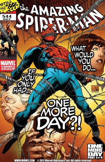
Amazing Spider-Man #544
| Writer | J. Michael Straczynski |
| Artist | Joe Quesada |
At his darkest hours, Peter has always had one shoulder to lean on, one person who'd remind him who he is, who he was, and who he can be. Now he's about to lose that person. What would he do...what would you do, if you only had "One More Day?"
CRITIC REVIEWS Back to Top
-
6.0
Comics Bulletin - David Wallace
Sep 07, 2007This extra-sized (and, at $3.99, extra-expensive) issue features a few bonus items in the form of a fairly extensive character biography for Spider-Man and a gallery of the many different costumes that he's worn over the years. We also get a look at some of Quesada's sketches, and a breakdown of pencils-to-inks-to-colors for one page of the Iron Man / Spidey fight. It's hardly material that anyone was crying out to see, and I don't really know why it's been included in this issue (other than to bump up the page count to justify the higher price), but some people may get a kick out of these extras. Read Full Review
-
5.0
Comics Bulletin - Ariel Carmona Jr.
Sep 17, 2007If theres one redeeming aspect to this comic, I would say it is that Joe Quesadas artwork isnt bad. Though I had grown accustomed to the regular artists style on this tile, Quesada does a good job of rendering the Spider-Man cast and is adroit at rendering action sequences, even if his Peter Parker doesnt resemble Peter in many of the books panels. The final two page spread featuring a Spider-Man webslinging in his red and blue costume doesnt make that much sense given the fact no reason was given to ditch the black suit. But then again, his reason to wear the black and white costume was also flimsy at best. Read Full Review
-
5.0
Comics Bulletin - Kevin Powers
Oct 16, 2007I also think another highlight of this issue is the inclusion of the Marvel Directory file and the bonus material at the end. For a $4 comic book, I commend Marvel for including such information. Personally I believe all comics should have at least one page of directors cut material because of the extraordinary amount of work that goes into these books. I also think including the long history of Spider-Man was a positive move, especially for those not familiar with Spider-Man or the current state of the character. Read Full Review
-
3.5
Comic Book Revolution - Rokk Krinn
Sep 08, 2007Amazing Spider-Man #544 was another abysmal read. JMS continues to go absolutely no where with this title. I am stunned at how bad this title has been over the past six issues. Talk about a complete lack of direction and purpose. This title has basically been slammed into neutral for half a year. Read Full Review
-
2.0
The Weekly Crisis - Kirk Warren
Sep 06, 2007Finally, the extra price tag for such lackluster extras was the final nail in the coffin for this issue. Did we really need a dumbed down <span style="font-weight: bold;">Wikipedia </span>entry with some rehashed artwork at the end of this issue? Was anyone interested in Joe Q's pencils and inked versions of the phoned in artwork that accompanied this issue? Save me the extra money and use the time wasted on these "extras" and work on the actual stories for the next couple parts of this event. Read Full Review
USER REVIEWS Back to Top
-
8.0
Apparently underrated.
+ Like • Comment• Likes (1) -
8.0
I don't know what to hate here at this point... Maybe only Quesada's weird faces of Peter. But it's really nice now, interesting to see Peter on the edge.
-
7.5
-
7.5
-
7.0
-
7.0
-
4.0
-
3.0
-
2.0
-
1.0
-
1.0
-
1.0
-
1.0


