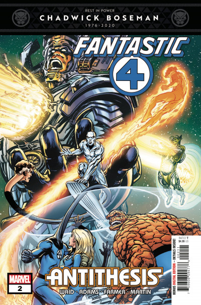
Fantastic Four: Antithesis #2
| Writer | Mark Waid |
| Artist | Neal Adams |
| Cover Price | $4.99 |
The Silver Surfer leads the Fantastic Four in a mad race to find the missing Galactus. Only he has the power to defeat Antithesis - the Negative Zone version of Galactus himself!
Rated T
CRITIC REVIEWS Back to Top
-
10
But Why Tho? - CJ
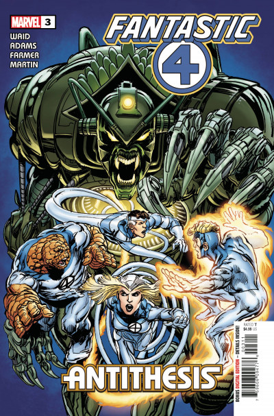
Sep 23, 2020Fantastic Four: Antithesis #2 features larger-than-life action and mind-melting images while bringing the First Family's newest nemesis to life. The miniseries is officially at the halfway point, and it's showing no signs of stopping. And from the looks of the next issue's cover, it seems like the Four are in for another big twist in their lives. Read Full Review
-
8.3
Comic Watch - J.A. Fludd
Sep 29, 2020Except for some glitches in art and history/continuity, this is a basically entertaining second issue of Antithesis. Reed and Johnny look great, Sue is as strong and beautiful as we want her, and The Thing still looks a bit too anthropoid. Neal Adams draws a cool Silver Surfer, except for the visible pupils in the eyes in that one panel. And it remains to be seen whether the alien menace gets any more original from here on. Read Full Review
-
8.0
Weird Science Marvel Comics - acnbat
Sep 18, 2020Final Thoughts:This is all I want in a comic book. A great story and great art! Mark Waid and Neal Adams take some of the most popular cosmic characters in the history of the Marvel universe and create a fresh new story with a classic look and feel. I really wish this wasn't limited to a five-issue mini! I'd be SO down on reading a title like this every single month! Read Full Review
-
4.0
ComicBook.com - Adam Barnhardt
Sep 23, 2020Some may love it for its nostalgic value but in an age where there's dozens of superhero stories to pick from any given week, Antithesis is largely forgettable and entirely passable. Read Full Review
USER REVIEWS Back to Top
-
9.0
Fun comic
+ Like • Comment -
9.0
I enjoyed this much better than the first issue. Waid is doing his thing with the FF. Neal Adams is amazing in some splash pages and spreads and then off in other panels but it's great overall and I enjoy his style for this book giving that classic feel.
-
8.5
Loving the Bronze Age style of writing and artwork here!
-
8.0
It's fun. Nothing groundbreaking or amazing, but it's just Waid on FF again, so it gets a recommend from me. Neal Adams' art is serviceable, I want to be careful with my words here since Silver Age purists will blast me, but I don't think Adams' art has aged very well. Landscape shots and big battle scenes were good because of the less detail required, but the close up individual characters did not look too good, the faces specifically.
-
7.0
I didn't like this as much as issue one, but it was alright.
-
5.0
This is absolutely not a style of writing that I enjoy, and they're already characters that I don't care for. Things aren't looking up for this comic.
-
4.5
The dialogue is a textbook example of "retro in a wholly bad way." The third-act fight (Annihilus, again) is pure filler. The now-revealed premise -- "We have to team up with Galactus to defeat super-Galactus!" -- feels painfully stale. I'm downgrading this from "for die-hard FF fans only" to "for die-hard Neal Adams fans only."
-
10
-
9.0
-
9.0
-
9.0
-
8.5
-
8.5
-
8.5
-
7.5
-
7.5


